Hi, I'm Andrew
I’m a design engineer and team leader — the kind of professional who not only designs and builds in the same breath, but also leads others to do the same. Where many designers hand off to developers, I carry work through to production while managing and guiding cross-functional teams to deliver high-quality outcomes. My core skillset spans UX design, front-end engineering, native mobile and responsive web development, and AI workflow integration.
Training AI with Data Pipelines
Palantir Foundry
Building the self-managing team
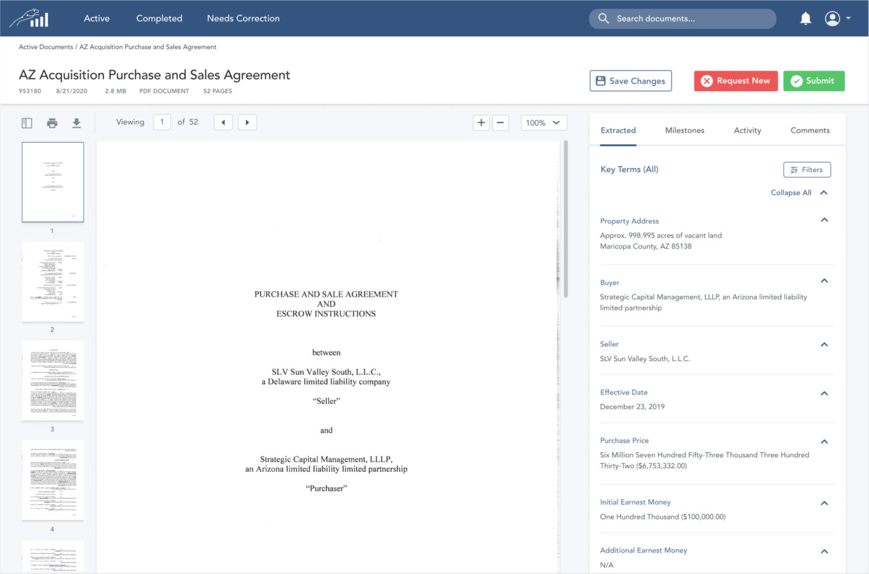
Real Estate SaaS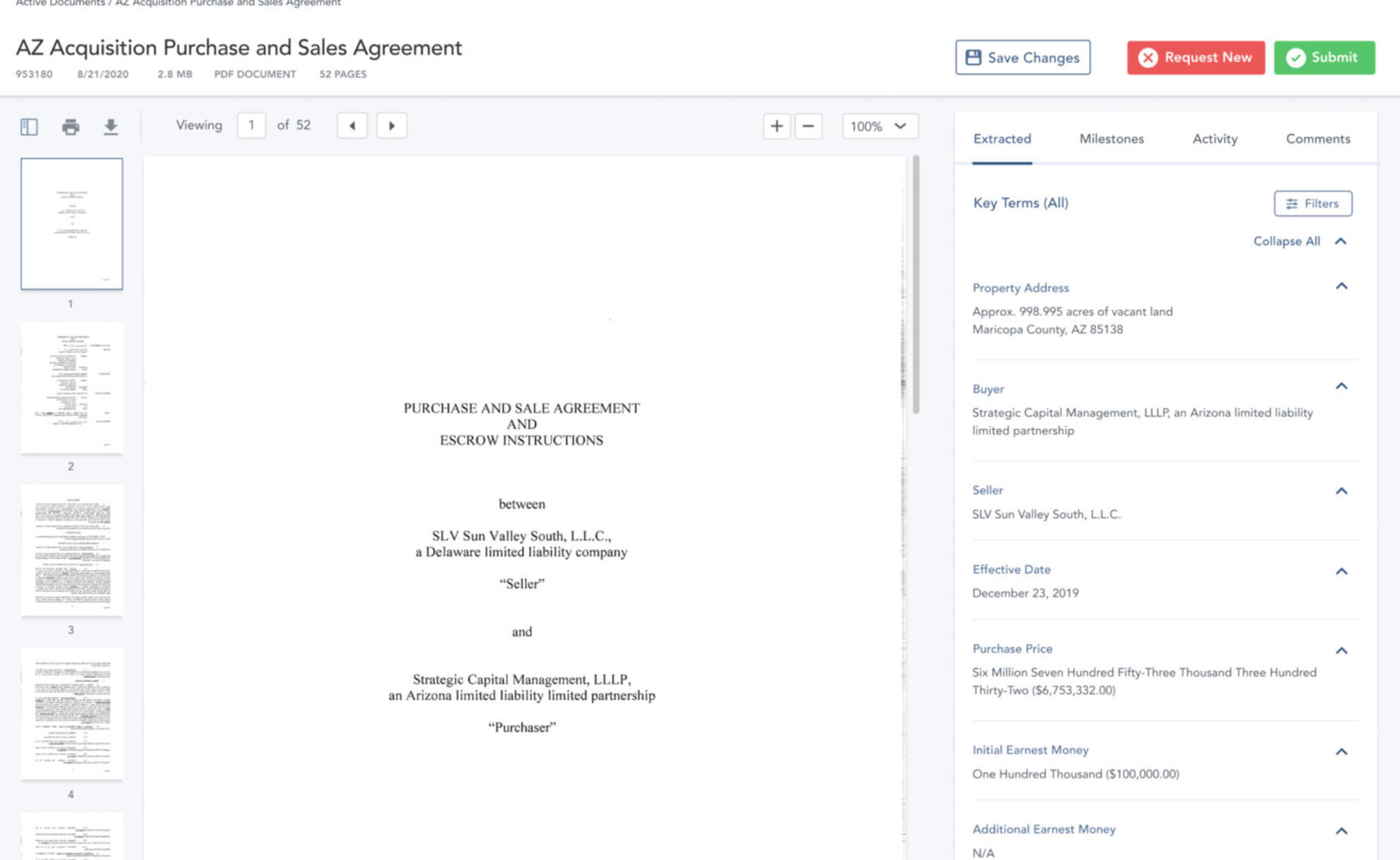
AI Document Processing
Real Estate SaaS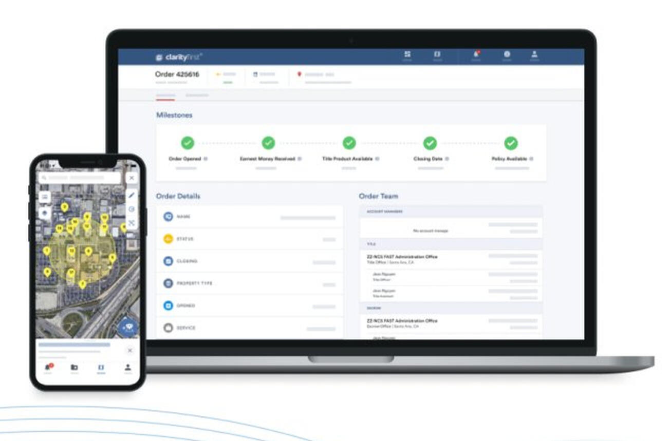
From 0 to $billions
Real Estate SaaS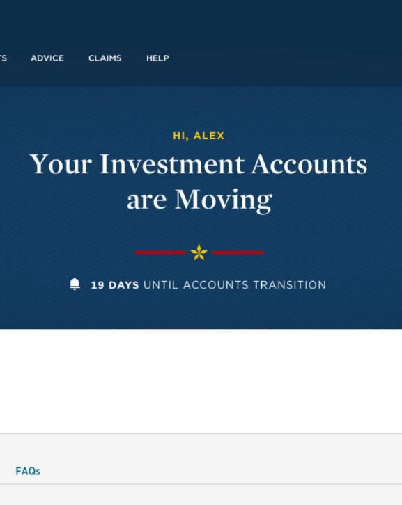
USAA to Schwab Investment Transfer
FinTech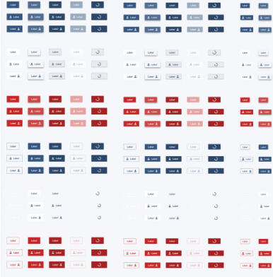
Building a design system
Real Estate SaaS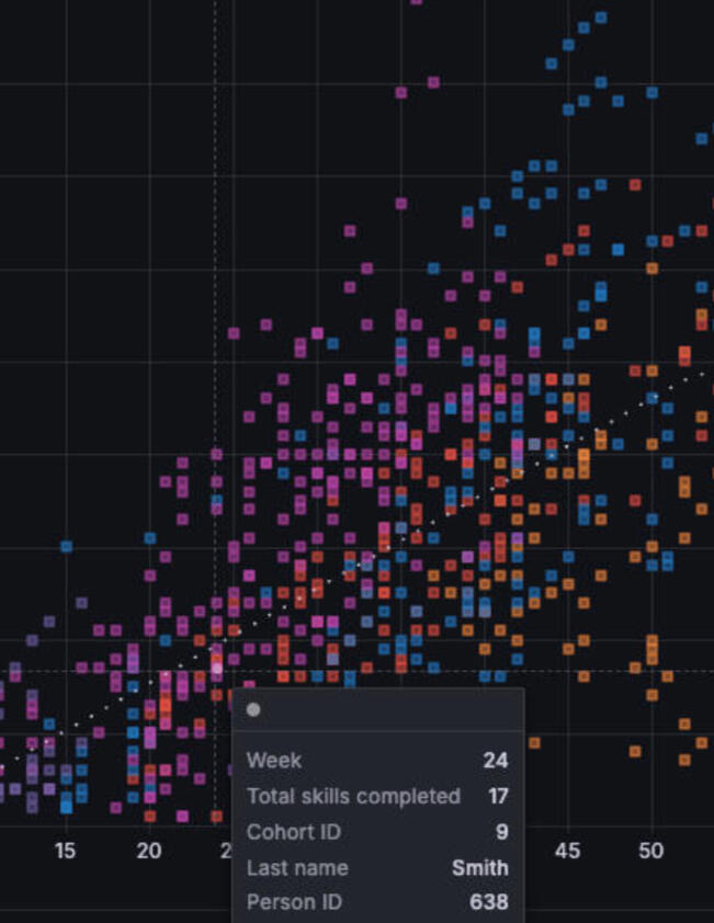
Data Visualizations
Investment advisor assistant
FinTech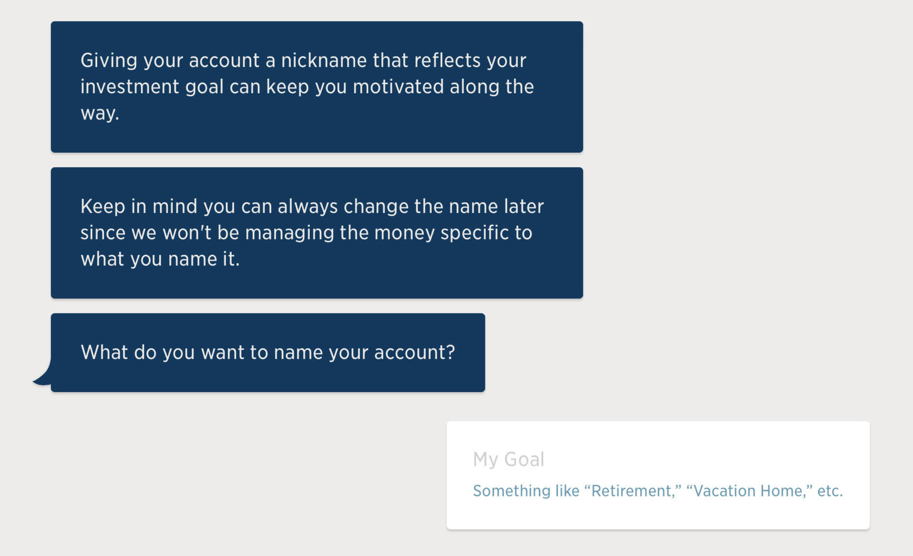
Making investments as easy as chatting with a friend
FinTech
GitHub with DesignOps
FinTech
Designing the web
Agency
© Andrew Deegear 2026
Down with the System
I inherited a basic design system which I continuously evolved, based on usage and tech needs, creation of a Design Council and managing a component library.

Design system customized and evolved from Material

Monthly or so updates

Date Picker component

Several versions of a common pattern

Filter component

Table column sorting

Button, button, who's got the button?


Building the Self-Managing Team
• Built and led a 7-person UX team across complex product ecosystems
• Created SOPs that increased velocity, quality, and team morale through 4 reorgs
• Scaled and evolved a custom design system beyond standard frameworks
• Delivered 6 enterprise applications supporting 500k users in billions of dollars of transactions.Below are a few examples of systems I created to organize the team.
Design Demo-lition
Set up and smoothed out the 'dog and pony show' for our design work.

Untitled

Untitled

Untitled

Untitled

Untitled

Untitled

Untitled

Untitled


Trust the Process
Inspired by a book on owning your own processes (E-myth Revisited), I put pen to proverbial paper and forged our agreements among the team and with our partners.This clarified a large amount of uncertainty and let the team focus on what they do best—design.

Collection on the left.

Untitled

Untitled

Untitled

Untitled

Untitled


It's Party Time
Getting the right people on an order is crucial to closing it on time—the number of potential parties involved here is mind-numbing.I kicked off the project and then guided one of my Senior Designers in how to structure this beast, including her setting boundaries with a PM who liked to skip research and a front-end engineer who played designer.

An early, simplified method of editing parties.

One of the challenges was to create an experience with limited page navigation—everything should be at the users fingertips to edit the entire team.

One of the party drawers.

Just a fraction of the flows.

Weekly design review is a team effort.

Example slide from one of the design demos.

Example slide from one of the design demos.


Check, One-Two...
We all can remember the lengthy checklist when closing on a home—this is the big brother of that on the commercial side.It's interactive and digital, however, speeding up the process and allowing for much more variation and convenience.(More to come)

Untitled

It's Important to Stay Mobile
Pushing the envelope for CRE on mobile.(More to come)

Untitled

Untitled


USAA-to-Schwab Transfer

We kicked off the project with a series of member interviews.

Affinitizing from the discovery interviews

One of the insights we derived from the discovery research

We knew that we'd need to get our members' attention...

...and sometimes interrupt them.

and the whole thing needed to be coordinated based on multiple events and tech limitations.

So we started sketching.

and we started wireframing

and refining

Until we had developed our user flows

and developed a main hub for the experience


DevOps: GitHub Blog Platform
Created for development-savvy bloggers desiring to internally socialize their team's work.I worked with Executive Greg Storey of WordPress, fame, to strategize and launch.

The default template, created using markdown files.

Served up on Github CI/CD pipelines, allowing for quick update commits and wide-ranging scalability.


DesignOps: Testing and Kanban
Pioneered in-house Design Validations for USAA Design, cutting turnaround time from 3 weeks to 4 days.Also, converted team to a continuous delivery kanban process instead of scrum to reduce time wasted pointing, carrying over, and repointing.

Testing process outline.

An example test plan.

Another example.

The kanban


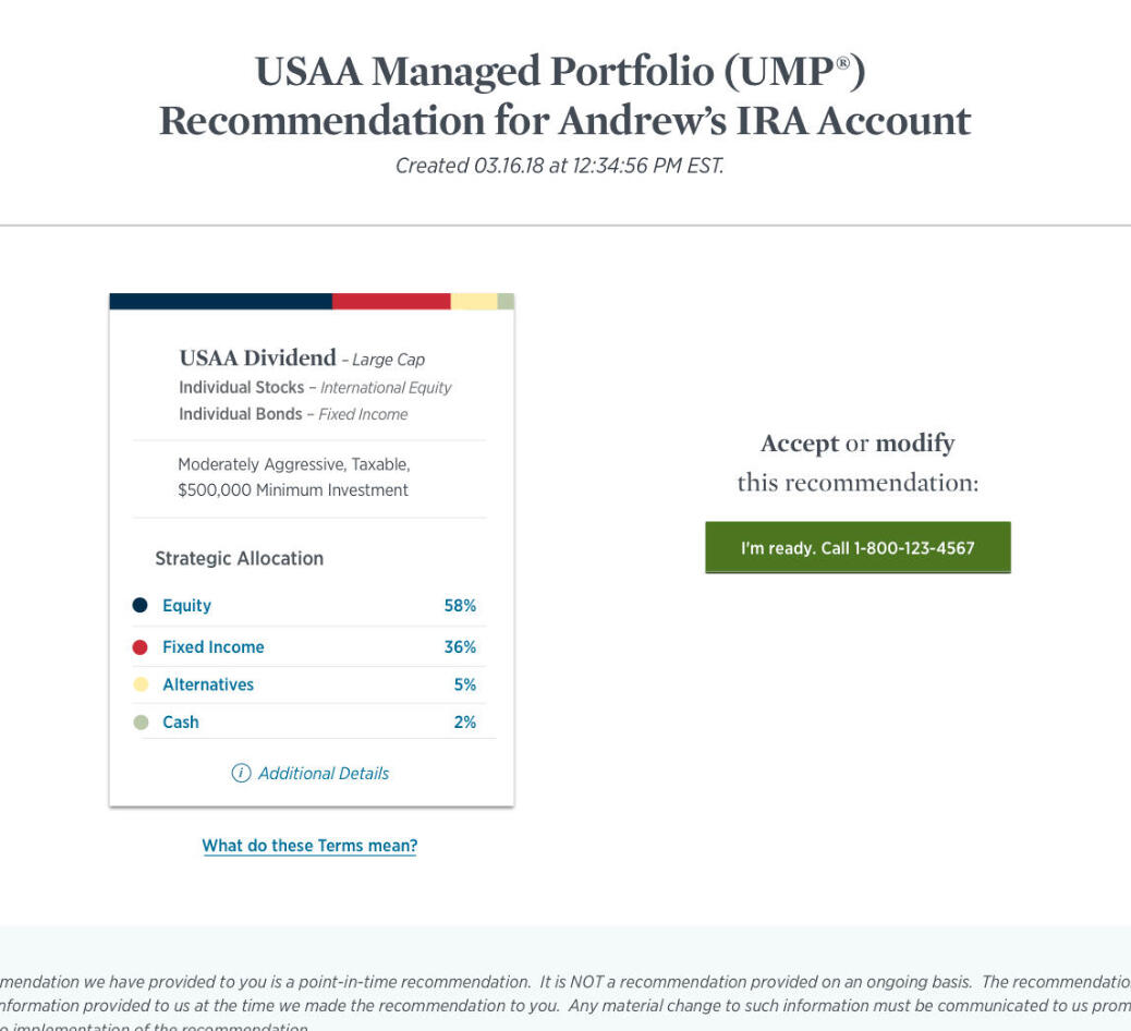
Fund Recommendation for Advisors
When on the phone with a member, Advisors needed a tool to help them select the right fund and to generate the right documentation for support and regulation.

Affinitizing user statements.

Journey map of the typical advisor call.

Facilitating workshops.

Whiteboarding the information architecture and user flow.

Paper mockup to let advisors show their priority and preference for each segment.

First pass.

Portfolio selection.

Member summary page.


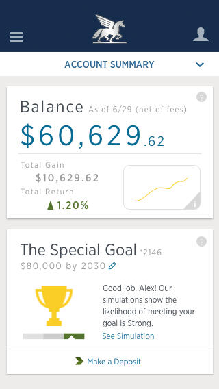
Robo-Advisor
In 2016 we launched a trimmed-down investment advisor to compete with the headline-grabbing Wealthfront. Here are several areas where I contributed.

Chat-like setup process.

Progress tracker for the account.

Helping users project their future earnings related to their goal.

Mobile projection with popover.

Dashboard showing growth and fund breakdown

Wireframe for mobile dashboard widgets.
Mobile dashboard with goal screens.

Account dashboard with summary.


Designing the Web
A small sampling of past web design projects.Each project typically involved collaborating on the design, coding into a CMS, and setting up the server.

DyslexiaSA

JRC Insurance

Exceedra

EverMarket


AI UI
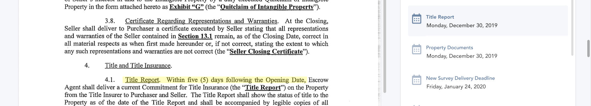
Our rough dev projects in AI needed to be fashioned into a functional experience ready for employees, so I quickly built out a strategy.Below you can see the original document processor, where it extracts information from scanned PDFs of Purchase Sale Agreements (PSAs).
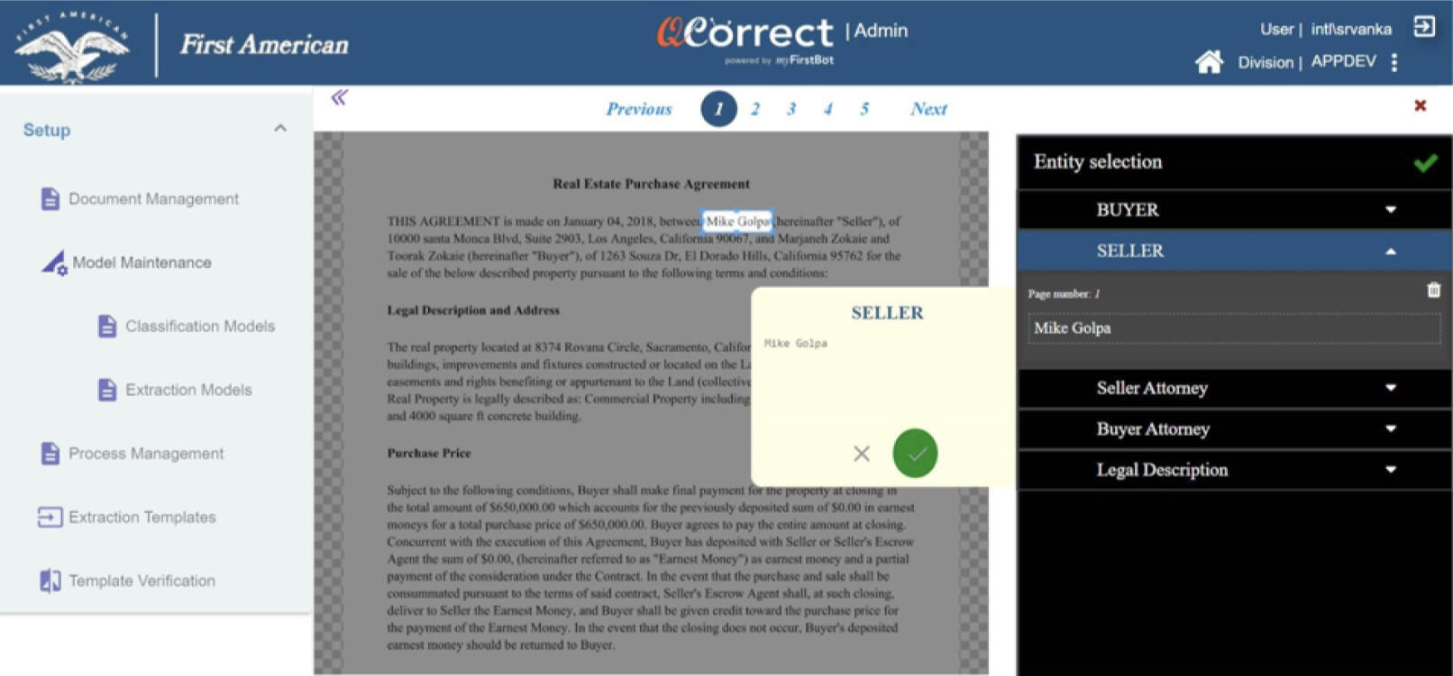
I wanted it in our main SaaS design system for easy integration and maintenance later on. I also wanted our novice users to be able to use it out of the box, so I identified UX interactions that needed major enhancement.Below you can see the redesign in the design system, with improved UX.
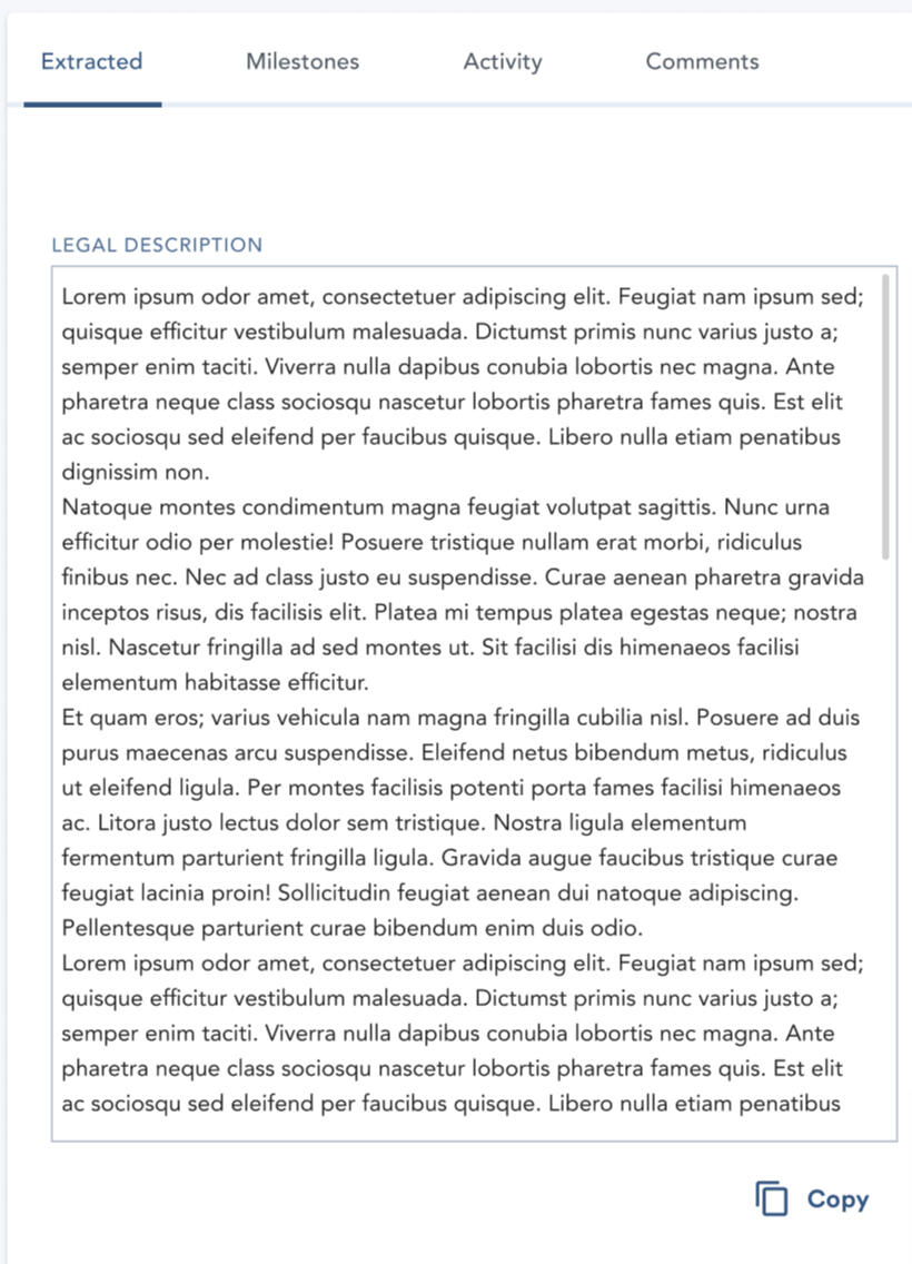
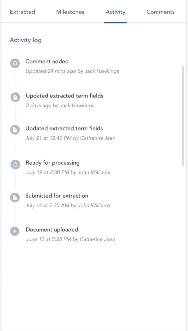
The legal property description can be extracted as well (left) and activity tracked (right).
Handwritten dates are turned into milestones.
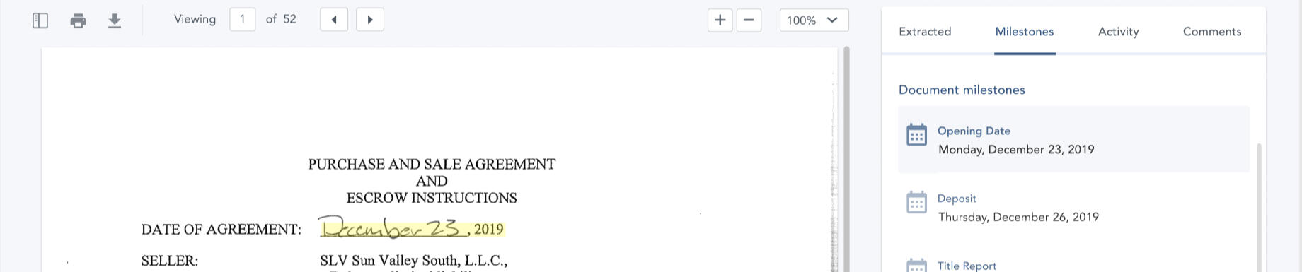
As well as relative phrases. Either can be highlighted while reviewing.
I tasked a senior designer with building the standalone tool into our CRE SaaS (ClarityFirst) as a first integration. Throughout this process, we collaborated on the direction and specifics.(more screens to come)
Data Visualizations
When validating student skill levels, we needed to visualize each cohort as it compared to expectations (dashed line).Here is an initial functioning prototype in Grafana for how to display this.

Level up instances on left, current position on right

Hover on left

Hover on right

Individual view

base SQL query for the data


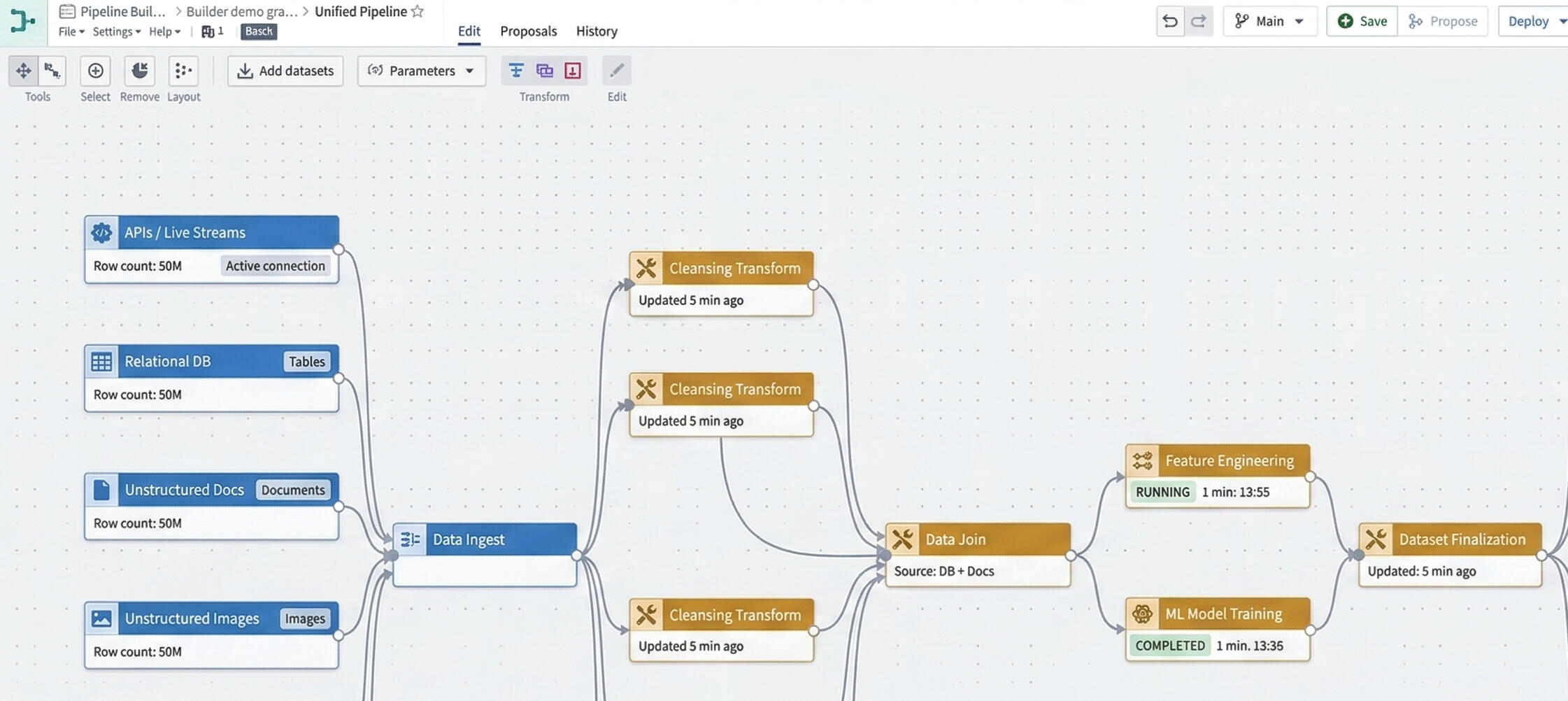
Training AI with Data Pipelines
Prevention programs often operate in a fragmented data environment... harmful behaviors, risk factors, and program outcomes live in separate systems, making it difficult to answer a simple question:Are our interventions actually working—and where should we act next?This project was developed to unify those signals into a single operational view, enabling leaders to move from reactive reporting to proactive intervention.
The Problem
Three core gaps emerged:
1. Lack of visibility
--- Harmful behaviors were tracked independently from upstream risk factors
--- No clear way to see emerging patterns early
2. Disconnected evaluation
--- Program success was measured in isolation
--- Limited ability to tie outcomes back to real-world impact
3. Slow decision cycles
--- Analysts had to manually assemble reports
--- Leadership lacked real-time situational awarenessThe result: decisions lagged behind reality.
The Solution
Create a data-dense, operational dashboard with the following:
1. Model the system, not just the UI
Instead of starting with screens, I mapped the ecosystem which drove the architecture.
2. Prioritize Information Hierarchy Ruthlessly
Borrowing from Palantir operational tools, the interface emphasizes KPIs, visualizations, and breakdown panels.
3. Design for Cross-Filtering and Causality Exploration
A key insight: users don’t just need data, they need relationships between data.
4. Make evaluation a first-class citizen
Most systems treat evaluation as an afterthought. Here, it’s central.

A unified dashboard for real-time, data-driven prevention decisions with an AI Analyst

Cleaning and joining data for the Ontology Object Types to feed as a locked data set to Claude

Trained AI models to generate real-time risk insights.


